Limited Edition Hocus Pocus Playing Cards
Hocus Pocus
To honor the 40th year of the business, his sons Max and Cole sat down with renowned card designer, Edo Huang, to come up with a deck that would capture the heritage and feel of the company, as well as appeal to all areas of card community.
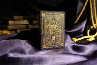
Hocus Pocus's doors opened in 1976 and the design of the tuck case captures the vintage feel of that era. The deep purple, paired with sculpted gold, hearkens back to the days when stage magic utilized contrasting colors and flashy patterns to capture one's attention. The rabbit ears and top hat logo have been reimagined to give a more classic feel, while light and airy scroll work provides a pattern without drawing attention away from the bold typography. The tuck will be printed on Soft Touch Stock with deep penetrating color for a velvet feel and classy look.
Edo set to work incorporating ideas from Max and Cole into what became the card back design you see today. The mirrored rabbit ears and top hat are positioned in the classic styling to provide the eye with a familiar layout. Edo and Max wanted to keep the back-design light and incorporate thin line scrolling to fill the space between the dotted- and broken-lined frames. Four-pointed stars are sprinkled throughout the design. They carry the theme from the card backs to the tuck case and continue on to the Ace of Spades. The deep purple is instantly recognized and conjures ideas of royalty, magic, and mystery. The gold tone inks contrast against the purple, and give a majestic feeling while adding to the vintage feel.
The idea was to make this deck usable in all categories, while still adding some custom touches that fit the theme. The card faces feature a light grey wash and fine line detail in the background to tie into the vintage look. The slight details add to the design while keeping the integrity of the classic look. The pips and indices are familiar to card enthusiasts and spectators alike. The Ace of Spades stands out and pulls the scroll detail from the card backs into the large styled spade.
With playability in mind, the courts have been recolored while keeping the USPCC traditional court faces, dress, and head wear. The color palate gives the courts a unique look while maintaining a sense of familiarity.
The Jokers offer a design area that doesn't need to conform to many traditions. The hat and wand symbolize the magician's tools of the trade, and pay homage to the countless supplies Paul spent so many years providing to magicians of all levels. Two exposed cards provide a unique reveal while paying tribute to a friend of the family and Hocus Pocus contributor, @56sealed.
United States Playing Card Company was chosen after weighing the pros and cons of each company. The options they offer in quality and materials used best fit our needs, and give us the right combination of materials and inks that will give us the look and feel we are going for. This will be a one-time print only and will never be printed again! This will help maintain the collectability we know many of our customers will appreciate. As a 40th anniversary deck, we feel a limited run of 2500, printed in the 40th year of business, is the only way to go. We have a close relationship with the custom deck department at USPCC and will work to ensure the highest quality possible.
Key Features: Proportioned borders Classic layout Recolored courts Smooth cut edges USPCC Bicycle Stock Air Cushion Finish Gold tone inks Soft feel tuck case Sculpted gold foil on tuck Limited edition, only 2,500 printed 40th Anniversary Deck Edo designed Reveal on King of Diamonds Reveal on Joker Blank faced card Double backed card Come join us in celebrating this once-in-a-lifetime opportunity!
